|
Microsoft Excel Graphing Basics
|
|
Producing Graphs: In this section, I will guide you through the process of making simple graphs. For this graph, I used a series of numbers and either squared (x^2) them or cubed (x^3) them. This particular graph is a line graph. There are options for all sorts of graphs/charts (pie, bar, column...).
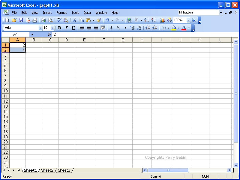
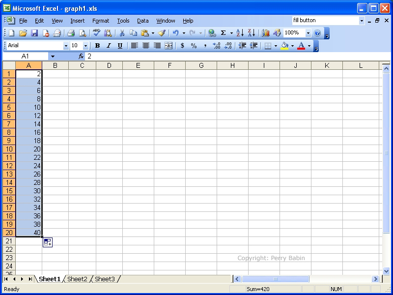
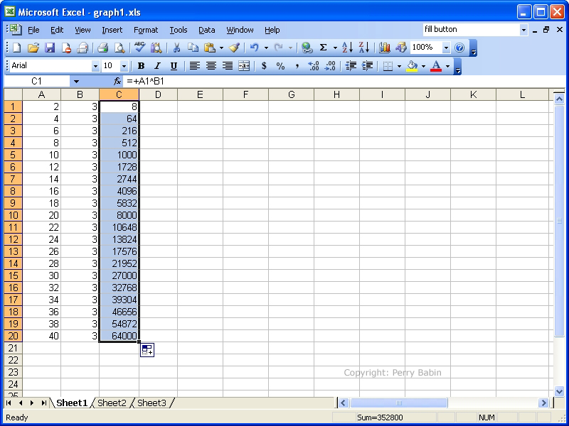
 Before we can produce the graph (graph and chart may be used interchangeably in this tutorial), we need to generate some values. To do this, I needed to create a list of numbers from 2 to 40. Instead of having to enter each number individually, you can use the 'fill handle'. The fill handle can generate a series of numbers based on the first number or two of the selection. To fill the first column of cells, I entered 2 and 4 in the first two rows. I dragged the mouse over the two filled cells to select them. If you look carefully, you can see that there is a small black square at the lower right corner of the selection. This is the fill handle. To fill the column of cells, I simply drag the handle down as far as I need. Here, I dragged it down to the 20th row.
 Below, you can see that I filled the second column with 3s. I did it with the fill process again but instead of filling and selecting two cells, I only had to fill and select one cell before dragging the fill handle. Here, you will also notice that I entered a formula in C1. This tells the spreadsheet to raise the value in the first column to the value in the second column. For this row, 2 will be raised to the 3rd power (2^3). When I hit enter, the value will be displayed in C1.
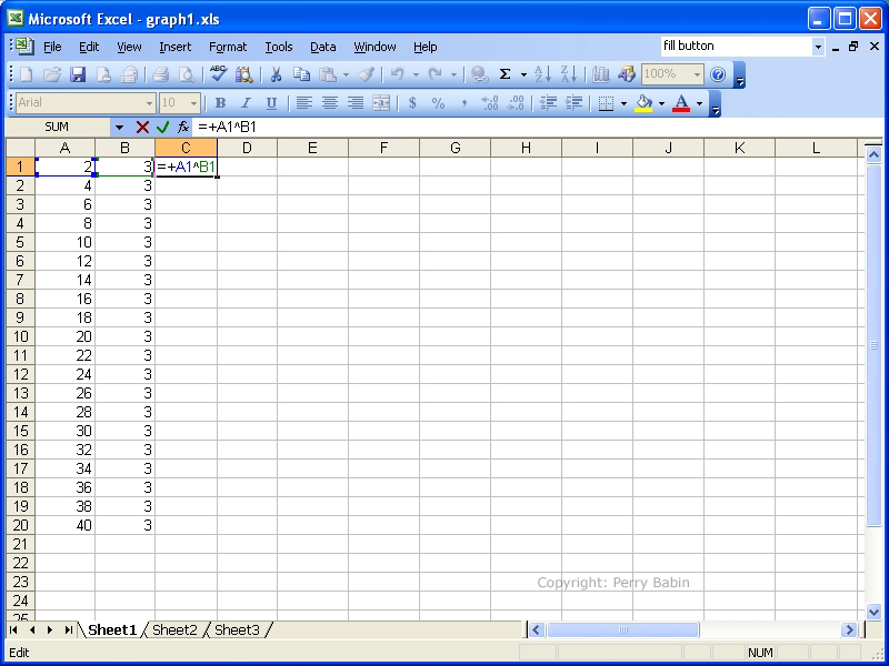 Since the fill feature works for formulas also, I can use it to fill the other rows in the column C.
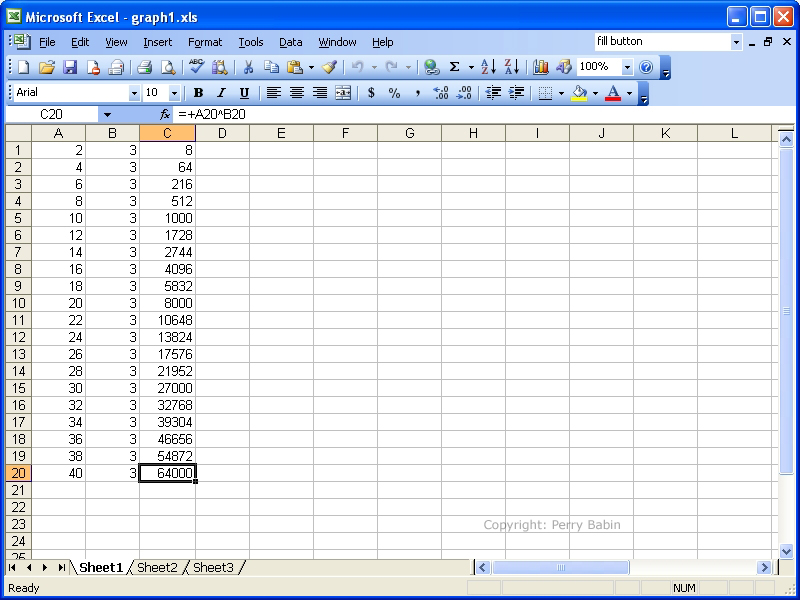
 This would probably be a good time to mention 'relative' and 'absolute' references. If you look at the sheet below, you can see that cell c20 is selected. If you look at the formula bar (just above the sheet), you can see the formula. You'll see that the formula was copied but the row values followed the row on which the formula was located. The spreadsheet understood that the value that was located two cells to the left of the formula was to be raised to the value just to the left of the formula. This is a 'relative' reference.
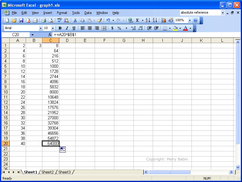
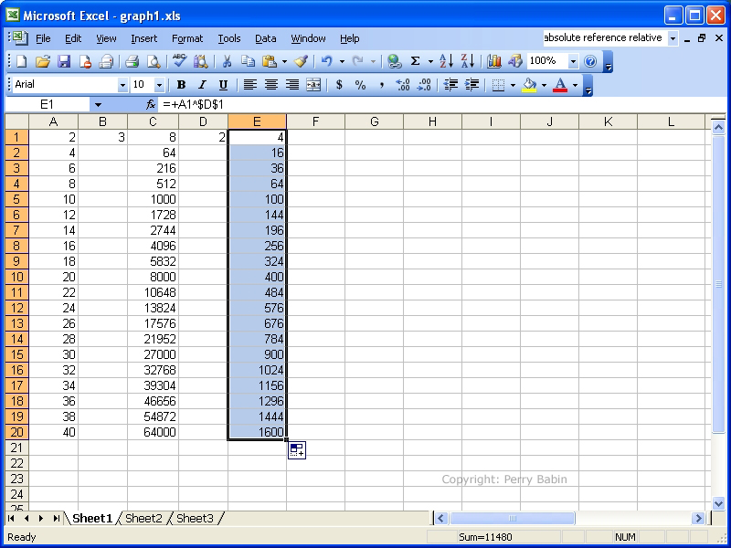
 Below, you can see 'absolute' referencing. This takes a value from a particular cell and uses it throughout the series of formulas. Here, I have again selected cell C20. You can see that instead of the reference value being B2, the value it $B$2. The '$' tells it that you want absolute referencing. This makes it easy to change a single value and have all of the resultant values change.
 Here, you can see that I've changed the '3' to a '4' and all of the values in column C have changed.
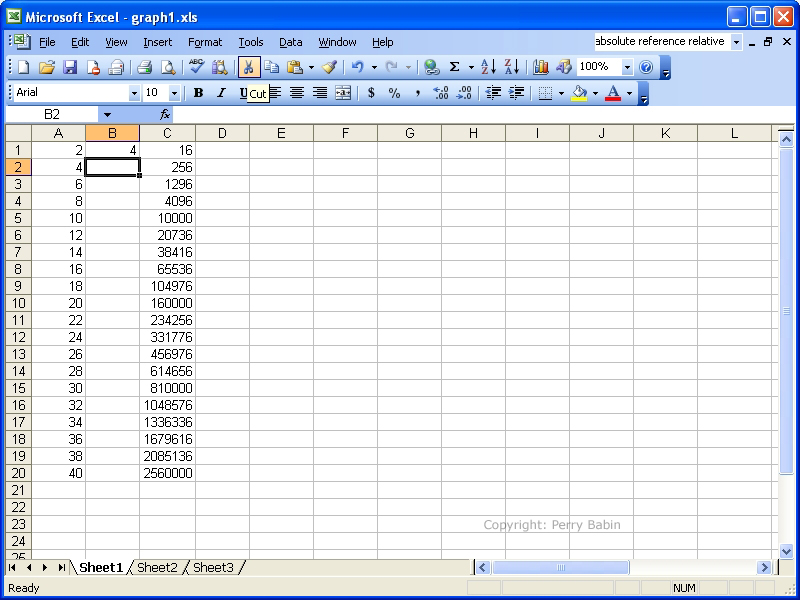 Below, I simply created another set of values. This time I raised the values in column A to the value of 2 (x^2). I again used the absolute reference instead of a relative reference.
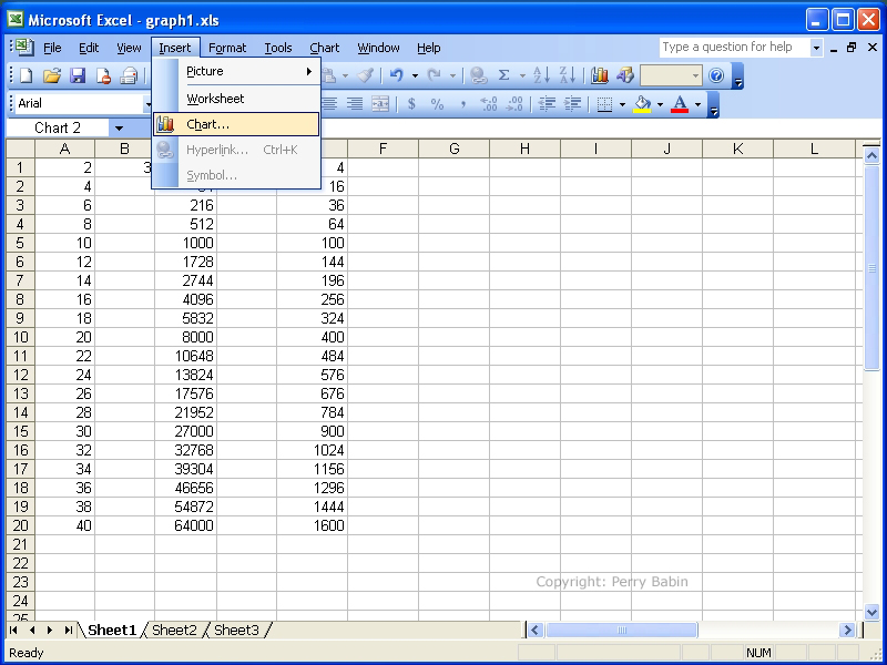
 To insert a chart, go to the toolbar and select INSERT >> CHART.
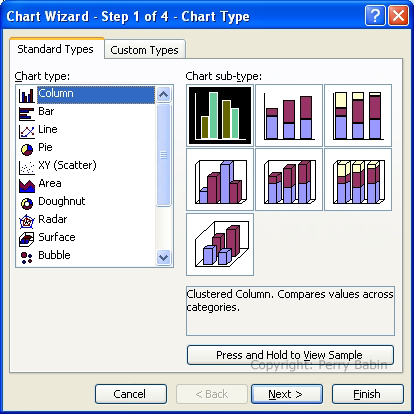
 This will be the first dialog box that pops up. You can select one of these charts or you can select another type of chart (from the left). I want a line chart.
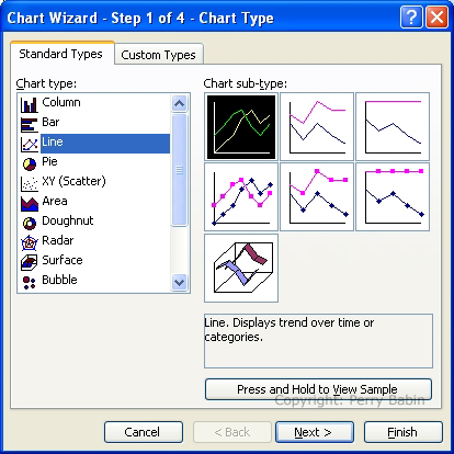
 These are the available line charts. I chose the most basic line chart (top-left) and clicked NEXT.
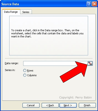
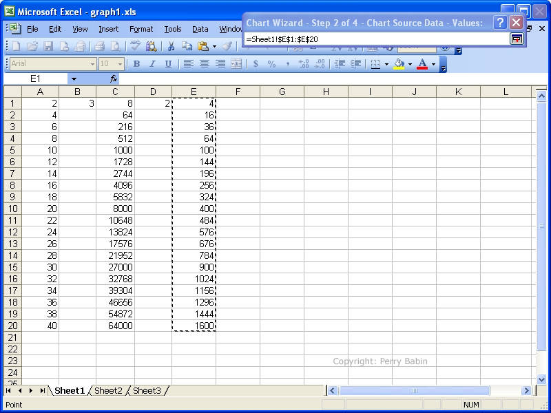
 Below is where you select the values you want to graph. I want to select the first set of cubed values from column C. To change screens back to the spreadsheet, click the button indicated by the red arrow.
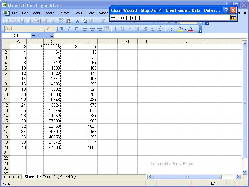
 When the window changes, select all of the values you want to graph. When that's done, hit ENTER.
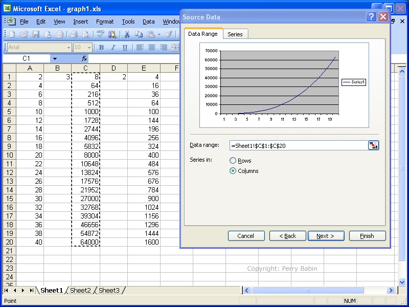
 Below, you can see a preview of the graph.
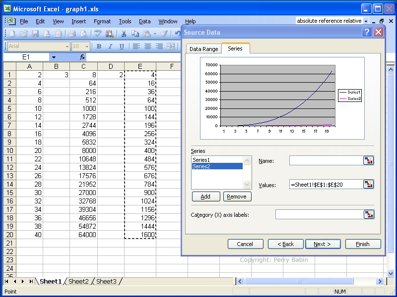
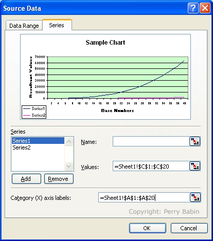
 If you want to select a second range, click on the 'series' tab and select ADD. On the right, click the button to add the new values.
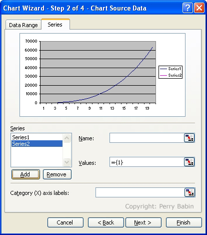 Below, we are adding the values for the second series.
 After hitting the ENTER button, the following screen shows us that we now have 2 lines on our chart.
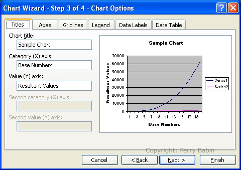
 The NEXT step gives us several options for the appearance of the chart. We can add a title, a name for each axis on this tab. Selecting one of the other tabs will offer other options.
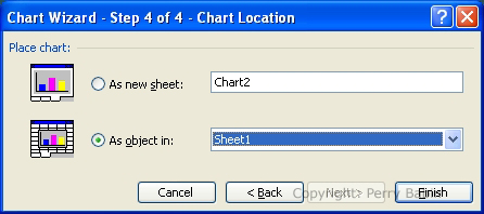
 This is the last step in making the chart. It simply wants to know if you want the chart dropped into the current sheet or into a new sheet.
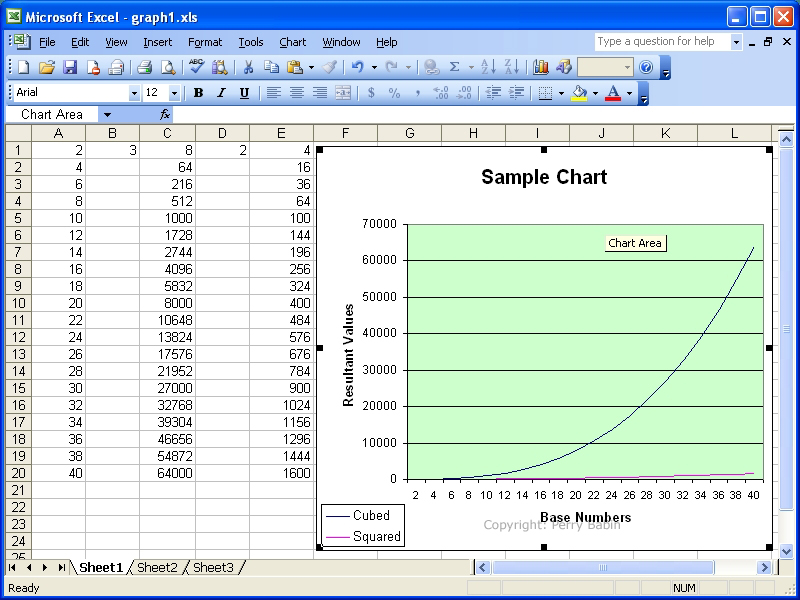
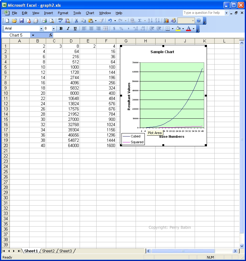
 Here, you can see that the chart has been inserted, positioned and sized to fit into the free space.
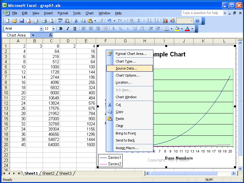
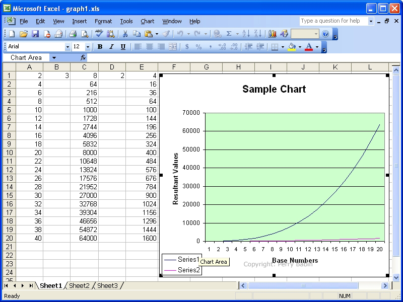 If you look at the x-axis (the numbers from left to right on the bottom of the graph), you can see that the numbers go from 0 to 20. This is the row numbers. If you want the numbers to reflect the numbers that you used in the calculations, you can change them. Right-click on the white area on the graph. In the dialog box, select SOURCE DATA.
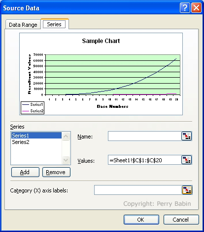
 On the SERIES tab, select the button to enter the values for the x-axis.
 When the screen changes, select the values in the first column.
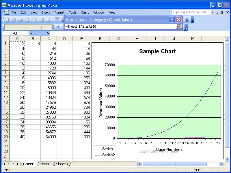 This shows you the new ranges selected for the x-axis.
 And below, you can see the new values at the bottom of the graph.
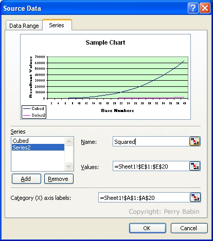
 So that the legend is more informative, I want to change 'series 1' and 'series 2' to 'cubed' and 'squared'. To do this, I right-click on the white area of the chart and select 'source data'. I then go to the series tab and click on the series name that I want to change. After selecting the series, I enter the name in the field to the right. When finished, click OK to close the dialog box.
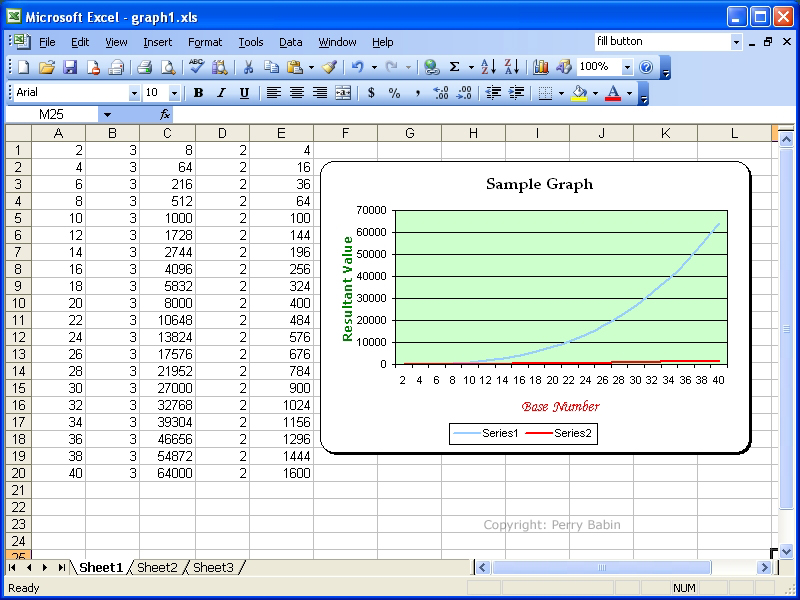
 This is the finished graph. You can see that it's a little different than the one I began with. You can change virtually any aspect of the chart you like (colors, fonts, sizes of items, positions of items...). To change the formatting of virtually any item, right-click on that item. You'll notice that a 'baloon help' text area in a couple of areas says 'chart area'. That's due to me positioning the cursor over that area for several seconds. It's simply letting you know which editable part of the chart you're positioned over. The cursor does not show up in screen captures.
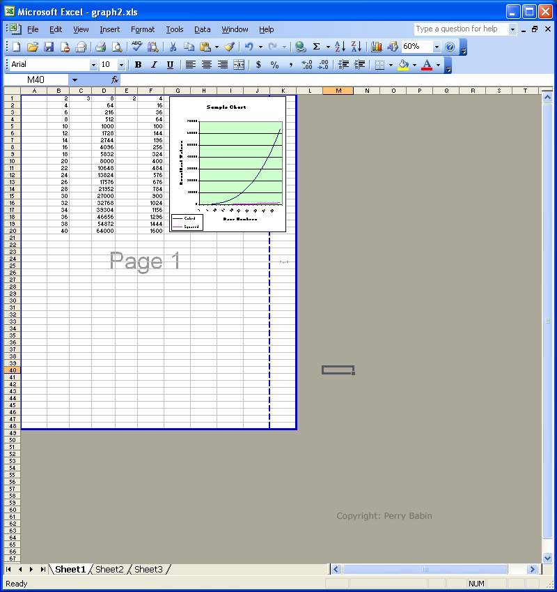
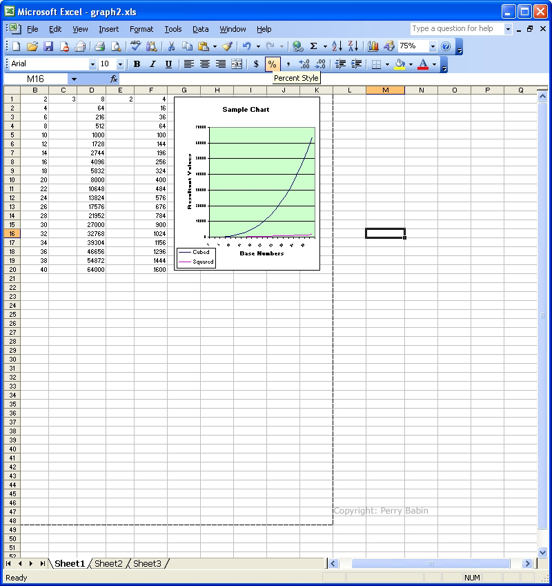
 Setting the Print Area: In this first image, you can see the same page as we were using above but I set the zoom level to 75% instead of the 100% that we were using above. Since we never printed this page, we need to set the page breaks so that the content will fit the page properly.
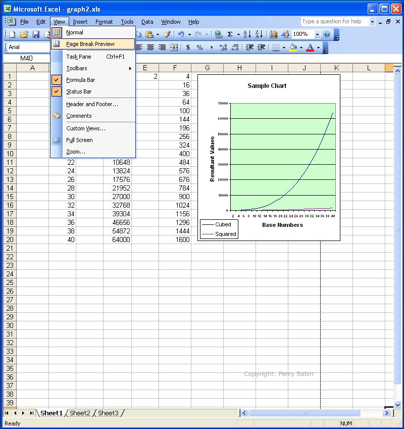
 To see where the default page breaks lie, click VIEW >> and select PAGE BREAK PREVIEW.
 This shows the page breaks. The default page break will fall just outside of the entire contents on the sheet. If you want a different set of page breaks, you simply drag the blue lines on the page break preview. If you see a blue dashed line, that's where Excel will start a new page unless you drag the dashed line to a solid blue line. If we were to print this without setting the proper breaks, it would fall on two pages (with just a small part of the graph falling on the second page).
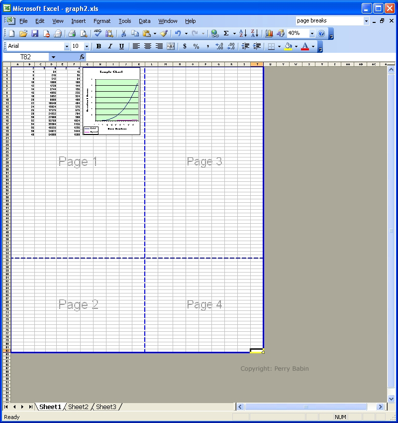
 This is what happens if you have the page breaks set too large. The Excel would print 4 sheets of paper if the breaks were set as shown below.
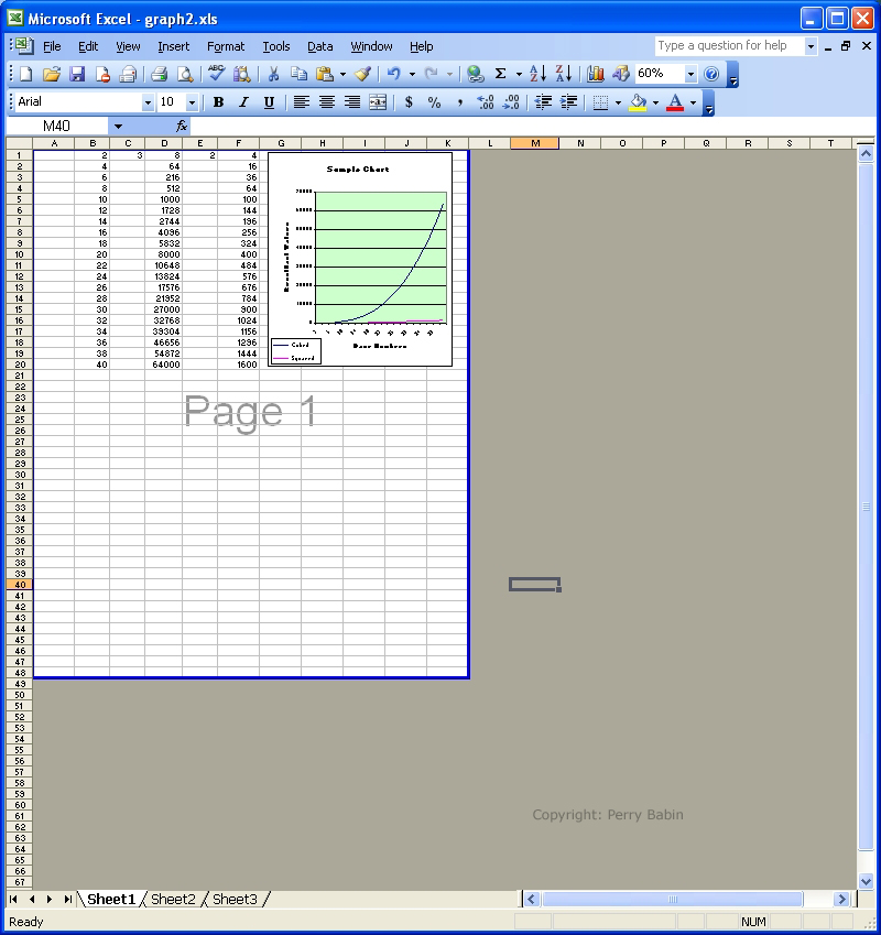
 Next, you can see that the page breaks are set as they need to be to print the desired content. Keep in mind that we could have a gazillion other things on the page and the only thing that would print as we have it set is the white area. If you do have a large spreadsheet and you do not set the breaks, Excel will print everything.
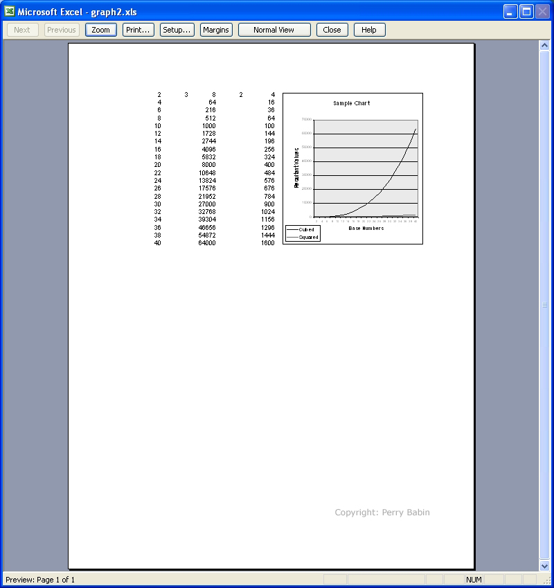
 To see how the page will look when printed, you can use the 'print preview'.
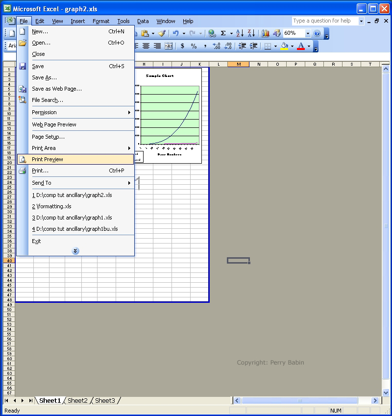 This is what the print preview page looks like. To go back to the sheet, you can click CLOSE, NORMAL VIEW or hit ESCAPE.
 To get back to the normal view, click VIEW >> NORMAL VIEW.
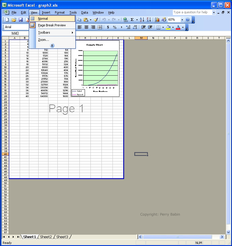 When you get back to the normal page, the light dashed line reminds you where the breaks are.
|
|
| Contact Me: babin_perry@yahoo.com | |
|
Perry Babin 2005 - Present All Rights Reserved
|